

It was only a question of time until I would run into the following issue:
The standard brand icon in Xojo Web 2 is a square (like any other icon on the web toolbar), but most company logos don’t fit into a square shape, like the following, for instance.
If you are trying to bring the above logo into a square, it will just not be readable at all, as we only have 24 px for the icons anyways. Try to explain this to any customer; a final “bye-bye” might follow it.
First “solution”
Sometimes you are lucky that your customer might already have a “logo” in a square format. Thank you, favicons!
Startups or more prominent brands are often aware that there is such a need. Take Xojo, for instance; their green square is recognizable enough to be used as a square icon without typing Xojo behind it. That’s perhaps why the developers didn’t care too much. But with an average small- or mid-size business, you won’t have much luck.
Usually, the web designer for those businesses builds “some” kind of a favicon, but it often doesn’t look too appealing. But at least you can use this as an argument for your particular customer: “Oh well, we just used your favicon, but of course we can use any other (square) logo you will provide us.”
In the above case, the solution will look like this:
A sexy-looking “P” … Now you know why I’ve put the solution into quotes.
Second solution
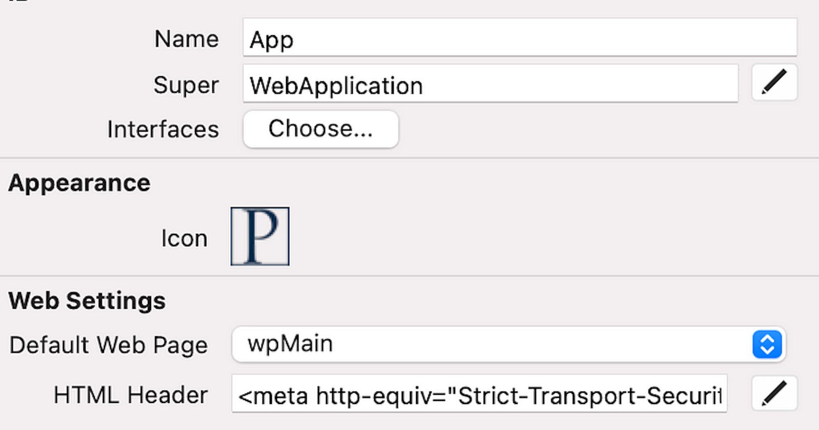
As very often with Xojo Web 2, CSS can help us to change the allowed dimensions of a picture the IDE is generating for our app.
In the “HTML Header” section you can easily “inject” your own styles and override settings from the embedded bootstrap.css. If I take the my original logo and change the height to 30px and the width to 69px I’m getting the following result:

For this you have to add the following CSS code into the HTML Header:
<style> .navbar-brand img.d-inline-block.align-top { width: 69px; height: 30px; } </style>
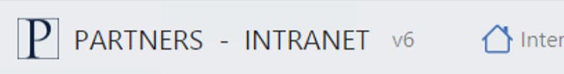
But this doesn’t look good yet!
You are right, even without zooming into the picture, you can see that it’s pixelated. Not good for presenting a prototype to a potential customer.
SVG will help us on this matter!

Now, this looks by far better and already almost as crisp as the “house” bootstrap icon on the right. Even when zooming in, it looks crisp: